@contenox/ui: the component library
@contenox/ui was Contenox’s own design system: a versioned, independently published React 19 and Tailwind 4 component library, built with tsup into dual CJS/ESM bundles with full type declarations, and catalogued component-by-component in Storybook. It shipped its own theme layer — styles.css, theme.css, fonts.css with self-hosted Geist and Geist Mono variable fonts — so any consumer got a consistent look without redefining tokens. Dark mode was a single custom Tailwind variant rather than a parallel token set, and Storybook’s theme addon rendered every story in both, so a component that only worked in one was caught in the catalog rather than in the app. React and its JSX runtimes were explicitly deduped in the Storybook build, closing off the two-Reacts failure that otherwise makes a library’s own catalog behave differently from its consumers.
Ninety components shipped across five families, eighty-seven of them with their own Storybook story: interaction primitives (buttons, inputs, selects, dialogs, tabs, tables, forms, pagination); a full chat kit (ChatThread, ChatComposer, ChatMessage, ApprovalCard, ToolCallCard, typing indicators, transcript embeds); a terminal kit (TerminalOutput, TerminalLine, ANSI rendering, a terminal prompt input); a visual workflow kit built on dagre graph layout (WorkflowVisualizer, WorkflowNode, WorkflowEdge, ExecutionTimeline, StateVisualizer); and structural pieces — resizable panels, a file tree, drag-and-drop, a command bar, a setup wizard. It was the library Beam’s entire admin and chat surface was built from.
The agent-facing components carried the real logic. ApprovalCard parsed a unified patch itself — reading +++ headers for the file path and @@ hunk headers for the line numbering — and rendered it through DiffView, with every label injectable so the same card could ship in another language. Terminal output went through a dedicated sanitizer before it ever reached the DOM, because a real PTY emits far more than colour codes: bracketed-paste toggles, OSC window-title sets, cursor moves and screen clears all render as literal garbage inside a <pre>. The sanitizer stripped OSC sequences, non-SGR CSI sequences, single-character escapes and stray control bytes while deliberately preserving SGR so a downstream colouriser still worked — a pure, idempotent function with its own unit tests, next to a full strip for copy-to-clipboard. Smaller decisions were pinned down the same way and unit-tested rather than tuned in a component: a chat transcript auto-followed new messages only while the reader was within 160 pixels of the bottom, and the composer’s character counter warned at seven-eighths of a 128 KiB soft reference before saying anything about the limit itself.
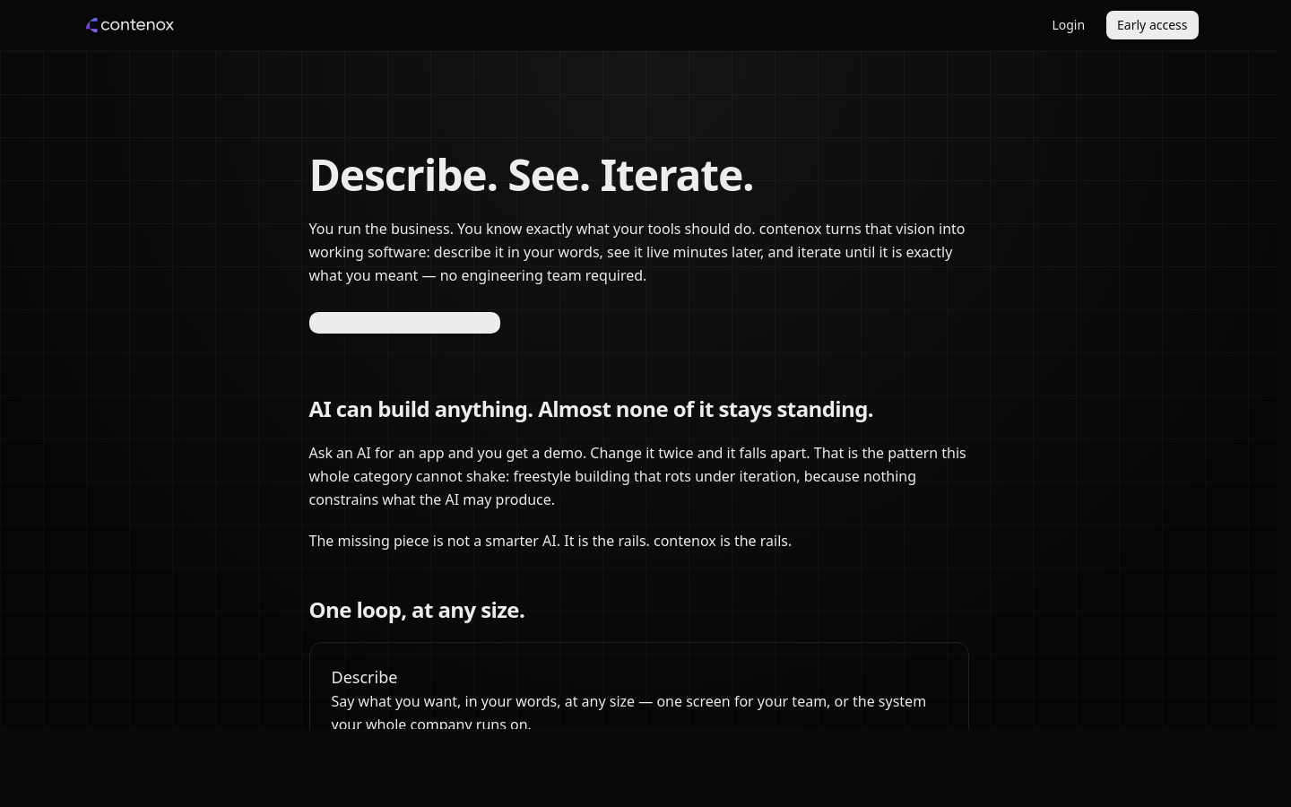
The component library dressed every surface the platform shipped — the marketing site, the workspace dashboard, and the operator console alike.
What it proved
- One design language stretched from admin tables to a terminal-native chat kit — proof that agent/HITL UX doesn’t need a bespoke component for every screen.
- Cataloguing components in Storybook, versioned independently of the app, let the design system be built and reviewed in isolation from Beam itself — eighty-seven of ninety components had a story, so almost nothing could only be seen by running the app.
- Purpose-built primitives for agent work — approval cards, tool-call display, diff-first review — are reusable interaction patterns, not one-off screens, once named and componentized.
- Rendering real terminal output in the DOM is a parsing problem, not a styling one. Stripping OSC, cursor and control sequences while preserving SGR — as a pure, tested function rather than an ad-hoc regex inside a component — is what made PTY output legible instead of littered with
[?2004h. - The judgement calls worth testing are the small ones. A scroll-follow threshold and a composer warning band, extracted into pure functions with unit tests, stayed consistent across every surface that used them.
Where this lives now
The interaction patterns it proved out — approval cards, tool-call display, diff-first review — now render as text and panels in the terminal UI experience, no React runtime required.